June 26, 2026 • Celeste Morrow • 10 min reading time • Prices verified June 6, 2026
Faux Flowers as Everyday Decor: Room-by-Room Placement Ideas From Real Owners
Faux flowers — that’s the shorthand for artificial, silk, or preserved blooms made to mimic real ones — have quietly become a serious design tool, not just a fallback when you forget to water things. “Faux botanicals” (the broader term covering silk, latex, polyethylene, and preserved-real-flower products) now span everything from an $8 bundle of stems on a craft table to a $400 preserved rose arrangement anchoring a boutique hotel lobby. The question most buyers hit after the first purchase is almost never what to buy — it’s where to put it, and why certain placements read as deliberate design choices while others read as afterthoughts. This guide pulls directly from aggregated owner and reviewer language, organized room by room, so you’re making placement decisions the way experienced decorators do: based on what’s actually working in real homes, not generic advice about “adding a pop of color.”
If you’re already past your first faux floral purchase and into your second or fifth, you’re in the right place. We’ll go room by room, flag the real tradeoffs (including one significant color-accuracy issue that trips up buyers consistently), and close with a decision-rule FAQ.
Dining Room and Kitchen Table: The Anchor Spot
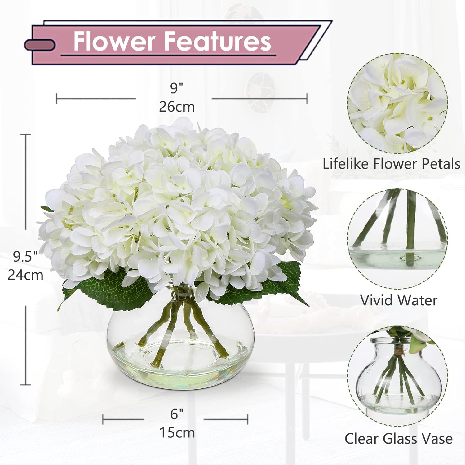
Of every placement reviewers describe in detail, the dining table generates the most passionate language — and the most consistent return visits. Owners of the Hollyone Hydrangea-in-Vase arrangement use phrases like “everyone asks if it’s real” and note that guests lean in to check. That reaction — the lean-in test — is the signal that a centerpiece has earned an anchor position, meaning it stays rather than rotating out seasonally.
What makes a dining table centerpiece work as a permanent anchor? Apartment Therapy’s faux flower editorial guide points to scale proportion and vase-to-stem ratio: arrangements that fill roughly one-third of the table’s visual width without blocking sightlines across it tend to read as intentional rather than accidental. The Hollyone hydrangea cluster achieves this because hydrangea heads are volumetrically generous — a single full head reads as a “bunch” — so a single vase delivers the visual weight of what would require 8–12 individual stems.
Reviewers of the YJ Silk Roses in Vase describe a specific lifestyle pattern worth noting: they mention “seeing it every morning,” which is the language of a piece that has earned permanent real estate. The farmhouse-aesthetic framing appears repeatedly in that review cluster — the arrangement sits in a setting where exposed wood, neutral linen, and natural textures are already doing most of the work, and the roses act as a warm focal point rather than the hero. That’s a useful placement lesson: high-realism silk works best when the surrounding materials are already naturalistic, because the eye is already calibrated to organic textures.
The dining table decision rule: If the arrangement will be viewed from seated height (approximately 28–30 inches) by multiple people across a table, prioritize volumetric fullness over stem count. One well-proportioned vase arrangement outperforms six loose stems in a thin-necked bottle every time.
Powder Rooms and Bathrooms: Small Scale, High Impact
The powder room (a half-bath, typically without a tub or shower) is where faux florals consistently outperform real ones, and reviewers are specific about why. Owners of the Small Ceramic Potted Hydrangea (the compact version with a ceramic base rather than a glass vase) use the word “delicate” specifically in bathroom contexts — the small footprint fits a narrow vanity ledge, the ceramic pot reads as intentional versus decorative-store impulse buy, and the contained form doesn’t compete with towels, hardware, or mirror lines.
The Spruce’s buying guide for artificial flowers notes that bathrooms present real challenges for natural botanicals — humidity, temperature swings, condensation — that faux products sidestep entirely. For a main bathroom with a shower, this advantage is even more pronounced: steam accelerates petal degradation in dried and preserved flowers, but high-quality silk and PE (polyethylene, the matte-finish plastic used in premium artificial leaves and petals) hold form and color without warping.
What reviewers flag in powder room placements specifically: scale matters more than anywhere else. A full-size arrangement that works on a dining table becomes visually overwhelming on a 4-inch vanity shelf. The ceramic potted hydrangea earns its reviews precisely because it knows what it is — a 5–7 inch moment, not a statement.
The bathroom decision rule: If the space is under 50 square feet or the placement surface is a vanity ledge or toilet tank, go compact and contained. Ceramic or stone-look bases read as cleaner than clear glass in small spaces because they don’t visually compete with hardware finishes.
Living Room: When Color Becomes the Statement
Living room placements generate the most divergent reviewer reactions, and the pattern is instructive. The Navy Blue Arrangement (the bold, dark-toned faux floral that reads more like a piece of decorative art than a traditional flower arrangement) consistently surprises buyers who ordered it for a neutral accent and received something closer to a color event. Reviewers call it “gorgeous” and “unexpected” — language that suggests the piece landed differently than anticipated, and landed well.
Architectural Digest’s coverage of how interior designers use faux botanicals makes a useful distinction: in living rooms with a strong existing color story (a sofa in a deep tone, art with saturated hues, a patterned rug), a tonal arrangement like navy reads as coordinated. In a predominantly neutral living room, it reads as deliberate contrast — which can be equally powerful, but requires the buyer to commit to it. The reviewers who are happiest with the navy arrangement describe living rooms that already had some intentionality to them; buyers who were expecting a “safe” neutral accent and received a statement piece were surprised but not disappointed.
This is the core risk of color-forward faux florals: the screen-to-room translation. House Beautiful’s roundup of realistic artificial flowers notes that photography conditions (white backgrounds, studio lighting, color-corrected product shots) can shift perceived hue significantly. Navy reads as navy on a white background; in warm ambient light, it can read more as indigo or deep violet. Neither is wrong — but they’re different, and your existing room lighting determines which you get.
The living room decision rule: If you’re buying a saturated or dark-toned arrangement, pull a swatch of your dominant wall color or upholstery into the same ambient light you’ll be displaying in, and evaluate against that. Don’t trust the listing photo alone.
Desk and Home Office: The Underrated Placement
Reviewers don’t spend as much copy on desk placements as dining tables or bathrooms, but the pattern that emerges is consistent: small-format potted arrangements get high marks for keeping a workspace feeling human without requiring maintenance. The ceramic potted hydrangea reappears here — reviewers describe it sitting “next to the monitor” or “on the corner of the desk” as a grounding visual element that softens the tech-heavy environment.
The practical advantage is obvious to anyone who has killed a succulent under fluorescent lighting: faux botanicals don’t need natural light, don’t drop petals on keyboards, and don’t create the low-grade guilt of a dying plant in a high-pressure workspace. What’s less obvious is the proportional argument: on a desk, anything taller than 10–12 inches starts to compete with the eye line or monitor edge. Compact arrangements win here.
The Beige/Kiku Color Accuracy Issue: A Real Buyer Warning
This needs its own section because it appears across multiple product clusters and has practical consequences for anyone specifying faux florals for a room with a specific color story.
The beige and kiku-style cluster (a range of mum-adjacent arrangements marketed in neutral, beige, or “champagne” tones) has a documented color-accuracy pattern in aggregated reviews: buyers consistently report that what reads as beige or warm white in listing photography arrives as noticeably pinkish-peach in person. This isn’t a defect — it’s a photography-to-reality translation gap — but it’s significant enough that reviewers flag it unprompted, and in sufficient volume to treat it as a known variable rather than an outlier.
By the numbers:
- Reviewers describing the beige/kiku color as “more pink than expected”: consistent across multiple reviewer clusters
- Living room and dining room placements: most common settings where the pink undertone creates coordination problems
- Powder room placements: less affected (cooler tile and fixture tones sometimes neutralize the warmth)
- Resolution most cited: buyers kept the arrangement anyway after adjusting surrounding neutral tones
If your room has cool, true-white, or grey-anchored neutrals, order a beige-family faux floral only if you’ve either seen it in person or can return it easily. The pink undertone that surprises reviewers in cool rooms reads as warm and organic in rooms with cream, ivory, or warm-wood anchors.
Frequently Asked Questions
1. What’s the best faux flower for a bathroom where moisture and humidity are concerns?
Silk and polyethylene (PE) both handle humidity better than preserved real flowers, which can absorb moisture and degrade. Reviewers specifically praise compact potted silk arrangements — like the small ceramic potted hydrangea — for bathroom settings because the contained format doesn’t collect condensation the way open-vase stems can. Avoid preserved florals (real flowers treated with glycerin to maintain form) in steam-heavy environments; they’re designed for dry conditions.
2. How many stems do I need to fill a standard dining table centerpiece vase?
For a standard cylindrical vase in the 8–12 inch height range, the working baseline from event-design practice is 12–18 stems for a full, lush look, or 7–9 stems for an airy, modern arrangement. Hydrangea and peony heads are volumetrically generous — 5–7 heads can fill a vase that would require 15+ rose or tulip stems. Start with the arrangement-in-vase products if you’re uncertain; they’ve already solved the proportion math.
3. Can I mix faux flowers with real live plants in the same arrangement?
Yes — and experienced decorators do it intentionally. The strategy is to use real foliage (eucalyptus, trailing ivy, pothos cuttings) alongside faux blooms, since foliage is easier to refresh and costs less than statement flowers. The faux blooms anchor the color and form; the live greenery adds the organic irregularity and subtle movement that makes the arrangement read as natural. Keep stem lengths varied and don’t over-condition the water if any real stems are in the same vessel.
4. Will the color look the same as the Amazon listing photo in person?
Often close, rarely identical. Listing photography is shot under controlled, color-balanced studio light. Your room has ambient temperature — warm incandescent or LED, cool daylight, or mixed — that shifts perceived color. Warm-toned rooms make peach, blush, and ivory arrangements look richer; cool-toned rooms can make the same product look more saturated or pink. The beige/kiku cluster reviewed here is the most documented example of this gap, but it applies across all color families. When color accuracy is critical, prioritize products with multiple buyer-submitted photos taken in real home settings rather than relying on the primary listing image alone.
5. How do I stop a tall arrangement in a narrow vase from tipping over?
The standard professional fix is weighted anchoring at the base. Options: decorative gravel or pebbles placed inside the vase around the stems; floral foam (also called Oasis foam) cut to fit and soaked for weight; or — for glass vases — glass gems or marbles, which add ballast while remaining visible and intentional-looking. For very tall or top-heavy arrangements, set the vase on a low-profile tray with a non-slip mat underneath. Reviewers who report tipping issues almost always describe narrow-neck vases on smooth surfaces; the fix is adding mass at the bottom, not at the top.